
The most beautiful homes are made even better by enlisting the discerning eye and experienced talent of an interior designer. When a good designer is involved in a project from the very beginning of a build, however, every aspect of the home is more successful. So it was with a young family’s charming home project just a stone’s throw from the Country Club of Mobile golf course when sisters-turned-design-partners Rachel Anderson, left, and Natalie Roe, right, were hired to draft the plans.
After a number of years working separately out of town and out of state for well-respected architects and designers, honing their skills and learning new methods, Roe and Anderson moved home and joined forces in June of 2017 with the creation of March + May Design. Their design studio operates out of a renovated storefront on Old Shell Road, where they offer help with home plans, renovations and refreshers.
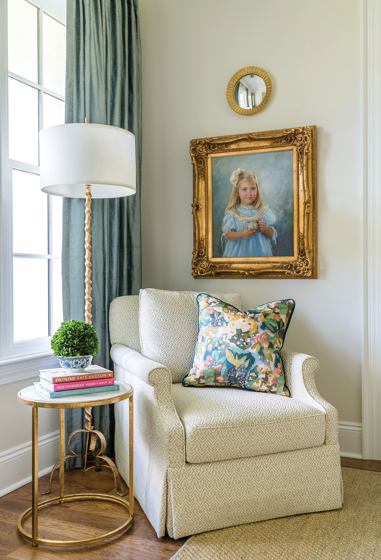
In this inviting home, every nook was well-planned, each piece of furniture found its natural home and the resulting décor shines with beautiful layers of color, texture and history. It’s a look that can be replicated by balancing old with new, sleek surfaces with texture and a hefty dose of granny-cool with an updated edge.
Not Your Mother’s Silk Curtains
A fabric that had once fallen out of favor is back in a major way. The billowing silk curtains of the 1980s and ‘90s get a chic reboot with a slim metal rod, tiny tailored pleats and a perfect floor-skimming length. While curtains are a major investment, don’t be afraid to try a bold, contrasting color!
For another old-modern mix, pair that antique dining table you inherited from grandmother’s attic with clean-lined chairs that have been upholstered in colorful fabrics. Yellow velvet pops on these oval-backed beauties. Meanwhile, a geometric rug designed for high-traffic spaces wears well in the dining room.

In the kitchen, Parisian bistro barstools bring a sense of history while sleek gold pendants hint at the Atomic Era. The white cabinets and countertops provide a fresh backdrop that unites the various fabrics, textures and styles.
The homeowner is a serious cook, so top of the line appliances and plenty of workspace were musts in the design drafted by March + May but not at the expense of gorgeous natural light. Lots of windows make working in this functional space a happy pleasure.

Wipeable Surfaces are Tops in the Kitchen
Durability and easy cleanup are no-brainers in family seating. This banquette was upholstered in indoor/outdoor fabric on the backs and vegan leather on the seats for kid-proof daily dining. The blue vegan leather relates back to the curtains in the kitchen and the wallpaper in the adjacent powder bath, continuing a theme to unite the different spaces.
A bold blue Dash and Albert indoor/outdoor rug is a must in high-traffic zones, like the one you find between the kitchen island and the massive Wolf range.
March + May pushed the wall of the kitchen out just enough to grab another window and a great storage nook. “It keeps the room from being one big box, making the home feel older than it is,” Roe says.


Florals Feel Fresh Again
The floral wallpaper in the little girl’s bath was a major commitment, but solid accents, such as the curtains, stool and vanity, keep the room from feeling busy. Neutral floors, counters and trim tone it down as well. With a fussy wallpaper, keep everything else tailored.
These cafe curtains are a more modern update on a classic window treatment that has experienced ups and downs in popularity through the decades. Now with clean brass hardware and a tailored fit, the look is current all the way. “We love a cafe curtain for the privacy it gives without sacrificing light!” Roe says.
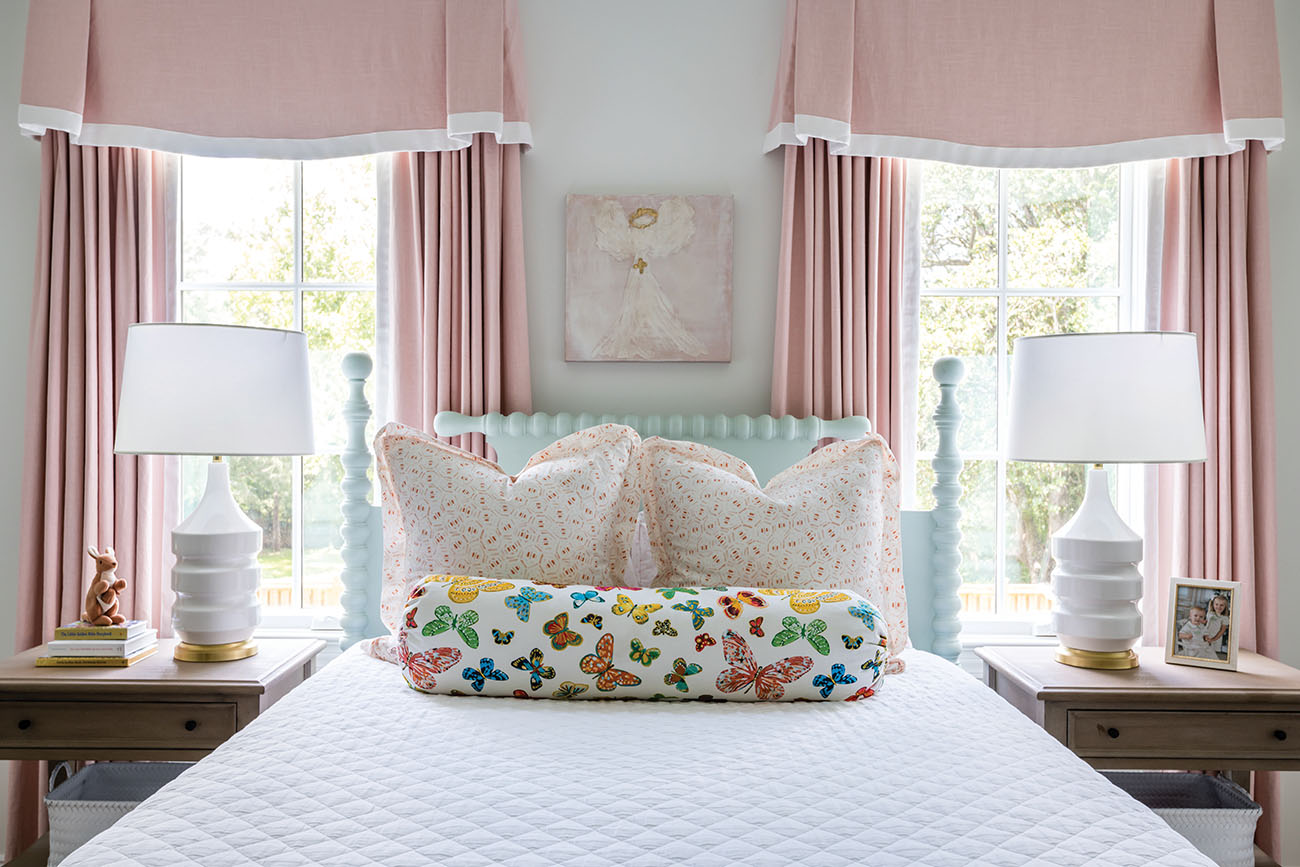
A vintage-style bed looks fresh and fun when painted an unexpected color. The cool blue keeps the pinks from going too sweet. The butterfly bolster was a last-minute addition to the fabric plans. Once the little girl saw it, she had to have it! Its bold colors balance out the softer shades of the other fabrics.

Add Punch with Color Top to Bottom
March + May chose a soothing green shade for the den and coated the walls, trim and ceiling in the same hue (albeit in different finishes), creating a cocoon of color that makes a clean backdrop for art, furniture and fabrics.


