A home should be a reflection of the people who live there, and as an interior designer, Fairhope’s Katherine Goldman is constantly working to achieve that goal for her clients. Sometimes, however, she has to help them take the leap into a look they’ve never tried before. “Adding bold colors to your home can be intimidating,” she admits, “but don’t feel like you have to jump into the deep end right away.”
With a major focus on interiors after the amount of time everyone spent at home this past year, vibrant colors, luxe finishes and unexpected accessories are making a huge comeback; think the Roaring Twenties after World War I and the Spanish flu, and you get the idea.
If you have a predominantly neutral or white interior, however, and are wondering if it’s even possible to bring color into your home, Goldman suggests you start by painting a small powder bath or kitchen island. “Ease yourself and your home into the idea of color.” It’s guaranteed to bring a little lift.
Goldman’s Tips for Bold Color
Find your balance
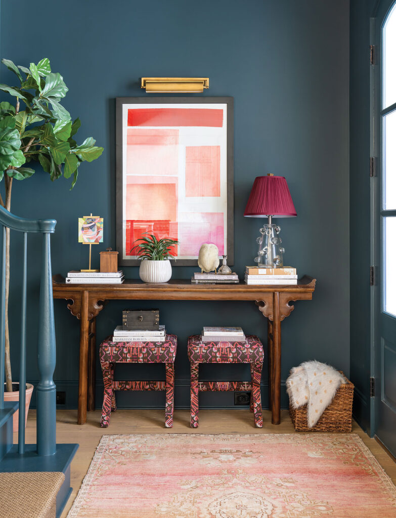
One of my favorite ways to incorporate bold colors, whether with art, paint or textiles, is to balance the bold with other classic and neutral design choices. Going bold in every aspect of a room can be jarring to the eye and look busy. In this foyer, the walls, art and textiles are bold, but the books are neutral, the antique console adds a classic element to the room and the rug softens the space. Plants are a favorite neutral of mine as well.
Cover it all
When going bold with paint, I love to cover the room’s walls, ceiling and trim in the same color for a dramatic effect. In general, this applies to rooms that have a definite beginning and ending and do not share walls with another room. A bold, contrasting trim is also a fun way to add some visual interest to a room.
Looking up
Ceilings are another great place to try bold color. If you are not quite ready to paint your walls and trim, try painting the ceiling of your powder bath, dining room or bedroom a vibrant or moody color. This is a great opportunity to play with high sheen or metallic paints as well. If you know you are going with a white ceiling, however, I recommend staying with a tried-and-true ceiling paint that has a very flat sheen.
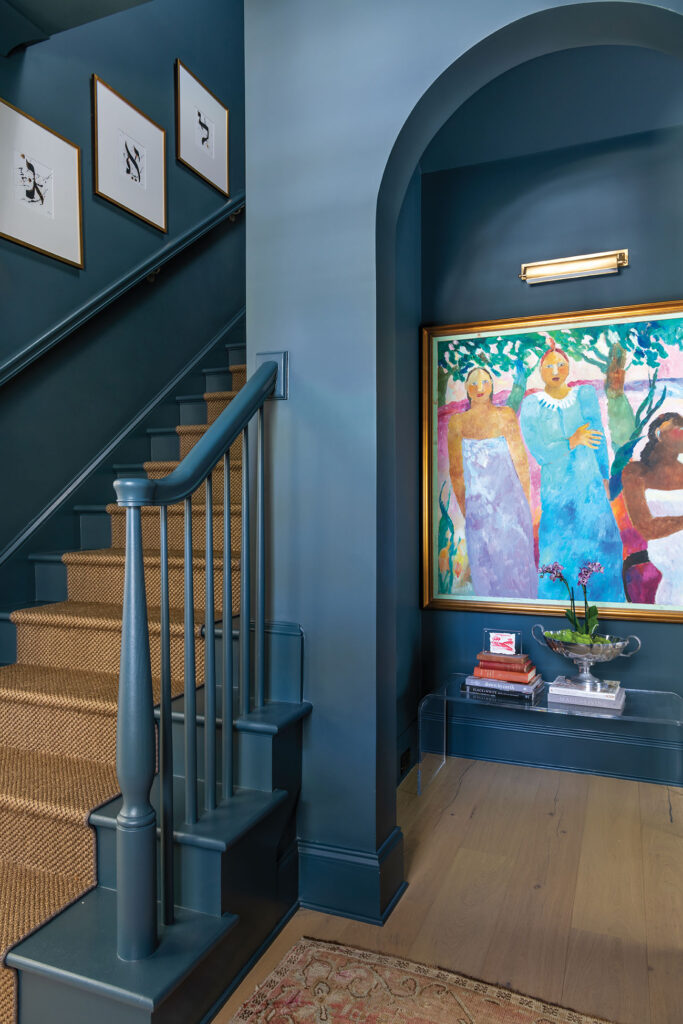
Vintage Oushak rug from Aubergine in Fairhope // ‘3 Island Women’ painting by Frantic from Fairhope’s Lyons Share Gallery 
Abstract collage art by Katherine Goldman // The bold pleated lampshade is an affordable Amazon find!
Pick the Right Paint

Townsend Harbor Brown
You can’t go wrong with this warm, muted brown, a part of Benjamin Moore’s Historic Color collection.

Green Smoke
A color inspired by both interior rooms and exterior trims of the late 19th century, this Farrow & Ball color feels classic and slightly weathered.

Naval
Sherwin Williams 2020 Color of the Year, this confident hue works as well on kitchen cabinets and exterior trim as it does on walls.

India Yellow
A moody mustard by Farrow & Ball that will warm up any space with its rich tones.
Paint Finishes 101
Goldman prefers painting walls in a flat or eggshell sheen. These sheens do not scrub clean as easily as others, but they do touch up with virtually no evidence of the fix.
Satin is a great choice for trim, and if you are looking for a bit more shine and ability to wipe clean, semigloss on trim is the way to go. Touch-ups on satin and semigloss tend to be more visible than those on walls painted in a flat sheen.


